 +1 (323) 522-4681 (USA)
 +44 (020) 813-30634 (UK)
 +33 (977) 218-777 (FR)
 +61 28005 7552 (AUS)
 +91 7980755100 (IND)

- Pronet Digital
- Why Pronet
- Portfolio
- Blog
- Contact
- Our Services
- Graphics Design
- UI/UX Design
- Website Development
- Mobile App Development
- Digital Marketing
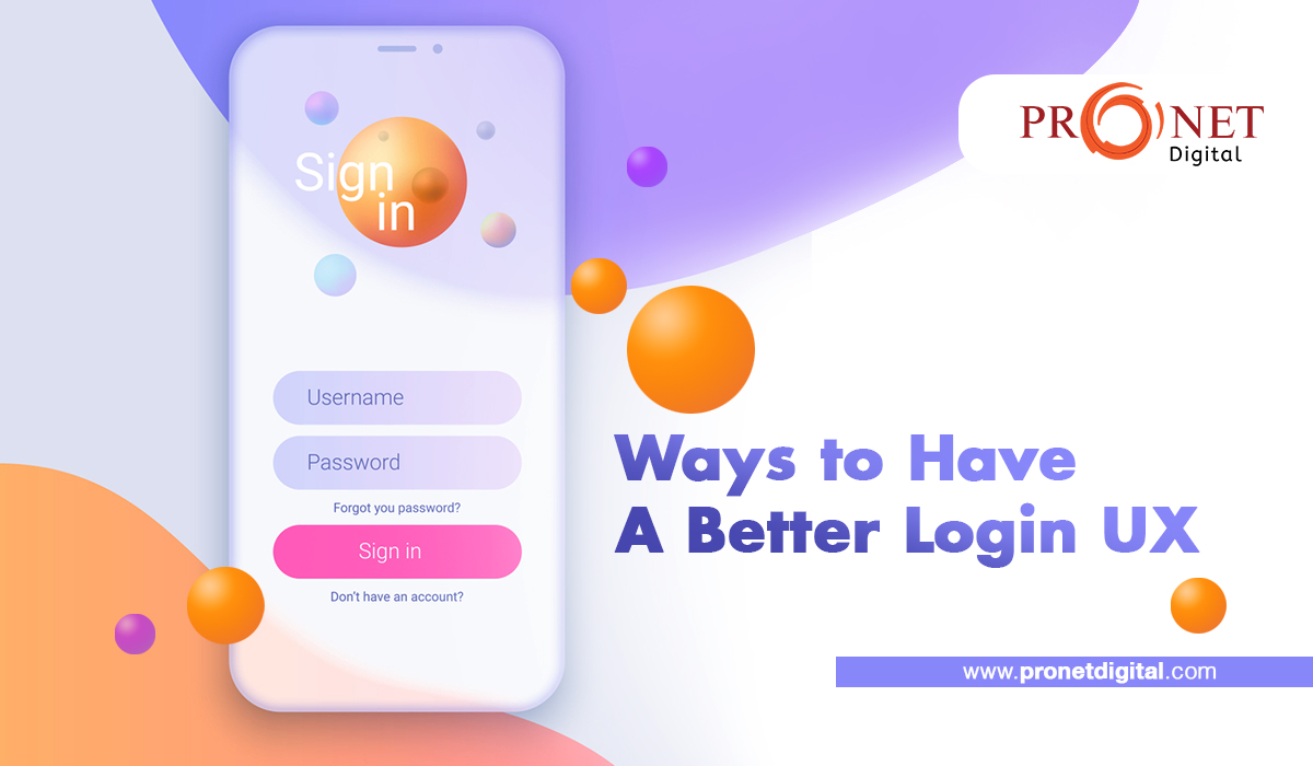
Listed below are some tips that can help you design a great login/signup UX. You can always contact a leading UI UX design company to design that for you. However, you should be aware of the features that make a login UX great so that you can ask the leading design company to incorporate those-
If you want to have an interactive design, the first thumb rule to follow is removing the interactions. It is important to remove all unnecessary clicks, reading, and waiting to improve interaction and keep the user engaged.
For instance, if most people opening the signup form will click on the first field, it is important to remove the hassles and help them autofocus on the same.
The only certainties in life are (a) death and (b) email addresses having a “@” and “.” in them. Mobile phones, thankfully, have special email input keyboards that display such characters – but you must use HTML to designate your textbox type=email. This is such a simple adjustment that will make the life of mobile users much simpler. Similarly, the telephone field should be designated as “type=tel” and URLs as “type= URL”. You can always contact a leading UI UX design company to get this done for you.
Rather than waiting until the user has completed the full form before pointing out any problems, notify them as soon as your system detects one. It makes sense to validate on blur for something like email (that is when they focus on another field).
Clickable labels should be included in every labeled text input you ever design. Surprisingly, HTML doesn’t accomplish this by default, but all you have to do is nest the input element within its label element and you’re good to go. Not only does this allow me to start typing without thinking about it, but it also aids me if my clumsy finger unintentionally misses the textbox by a fraction of a second. You can take the help of bespoke UI and UX design services to help you achieve this.
There should be no need for users to guess what the password requirements are. Demonstrate when they’re according to requirements and when they’re not.
Allowing users to see the password they’ve typed avoids difficult UX issues like accidentally picking a password – and it’s also less onerous than forcing them to input it twice.
The labels on your buttons are a chance – of course, to entice your users to click through.
So, while designing the button, consider this: what value does a user expect on the opposite side? Is it registering for a free account? Is it possible that I’m only 30 seconds away from witnessing the future of work? To get it done, contact a provider of bespoke UI and UX design services now.
Why should consumers have to cope with yet additional login and password for our mundane service? What if we let them use an existing username and password – and hear me out on this – Like their Gmail address or Twitter username, for example!
Isn’t it crazy?
But that is precisely what we can all do. And, unless you have compelling reasons not to, it is strongly advised.